-format(webp)/cdn.vox-cdn.com/photo_images/5288630/137361790.jpg)
As you hopefully have noticed by now, the LA Galaxy have a new home uniform this season. The home shirt debuted at the press conference announcing David Beckham's return, and has many features that pay homage to the Galaxy's past. The official uniform supplier of MLS, adidas, was kind enough to send me one so I could analyze it up close.
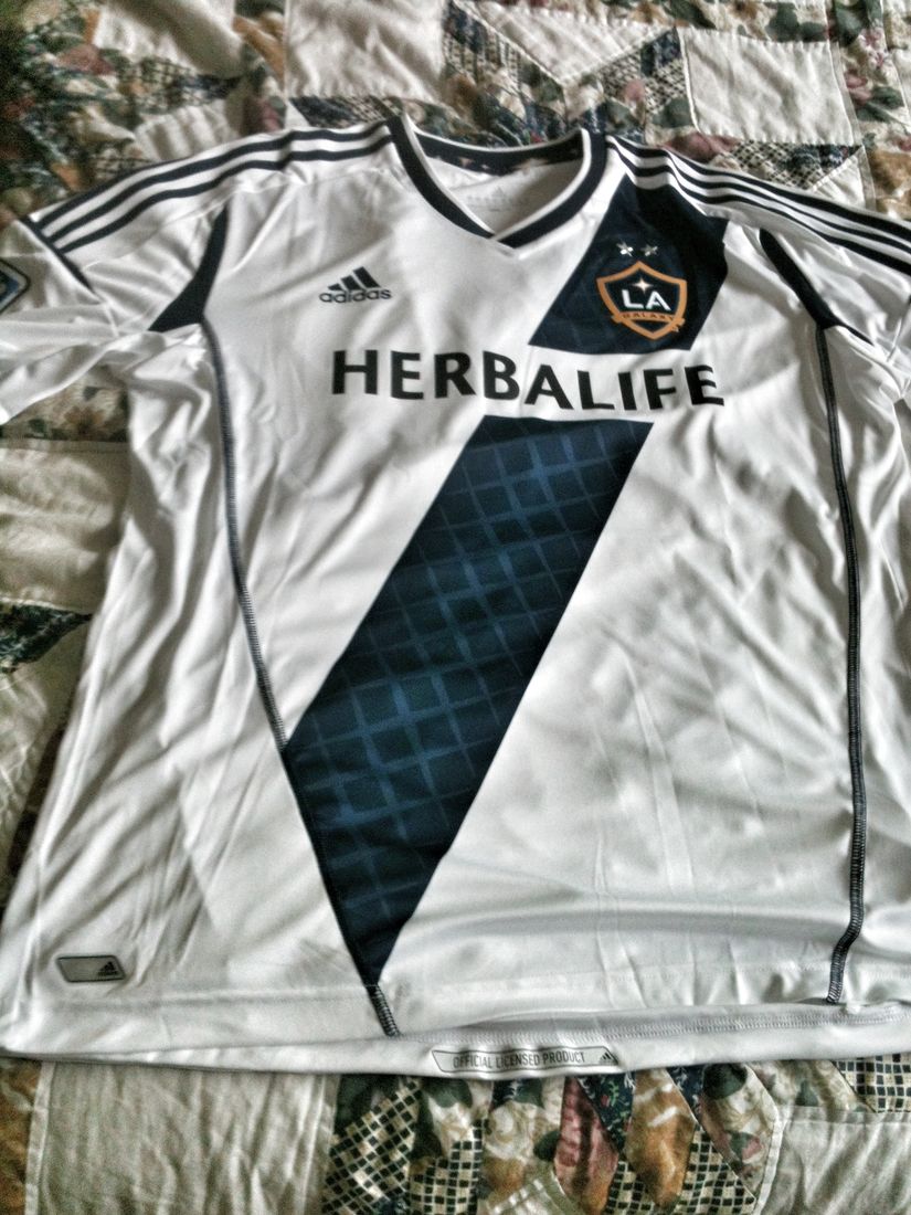
Just from a purely aesthetic standpoint, it's a very nice looking shirt. I like the all white design where the three stripes on the shoulder are the same color as the other accents on the jersey as opposed to the Galaxy's most recent home shirt where there was a blue shoulder yoke resulting in white three stripes on a white jersey. It's also terribly comfortable to wear. Very lightweight, I can see how a player could run seven miles in this and not feel bogged down.
Also, I learned that the graphics on soccer jerseys are usually heat pressed. Never really thought about it growing up, since no matter what the sport you were playing it was usually in some form of a glorified t-shirt. I knew on baseball jerseys every element is sewn on, and this is the first pro soccer jersey I've ever owned. Learn something new every day!
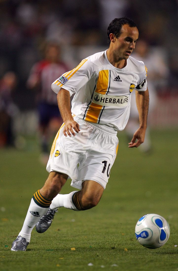
According to the press release, the Galaxy's "home" jersey design is inspired by the 2007 LA Galaxy Jersey and pays homage to the iconic sash stripe that was featured across the chest. Adidas, after getting the exclusive MLS uniform contract in 2006 went with a modified version of the sash design the Galaxy had been given by Nike.
To be fair to adidas, their take on the sash was much cleaner looking that Nike's was. The Galaxy won their second MLS Cup in 2005, so there's one star over the old crest and older more patriotic version of the scudetto (complete with the old wizard hat version of the MLS Cup trophy) on the opposite side of the chest.
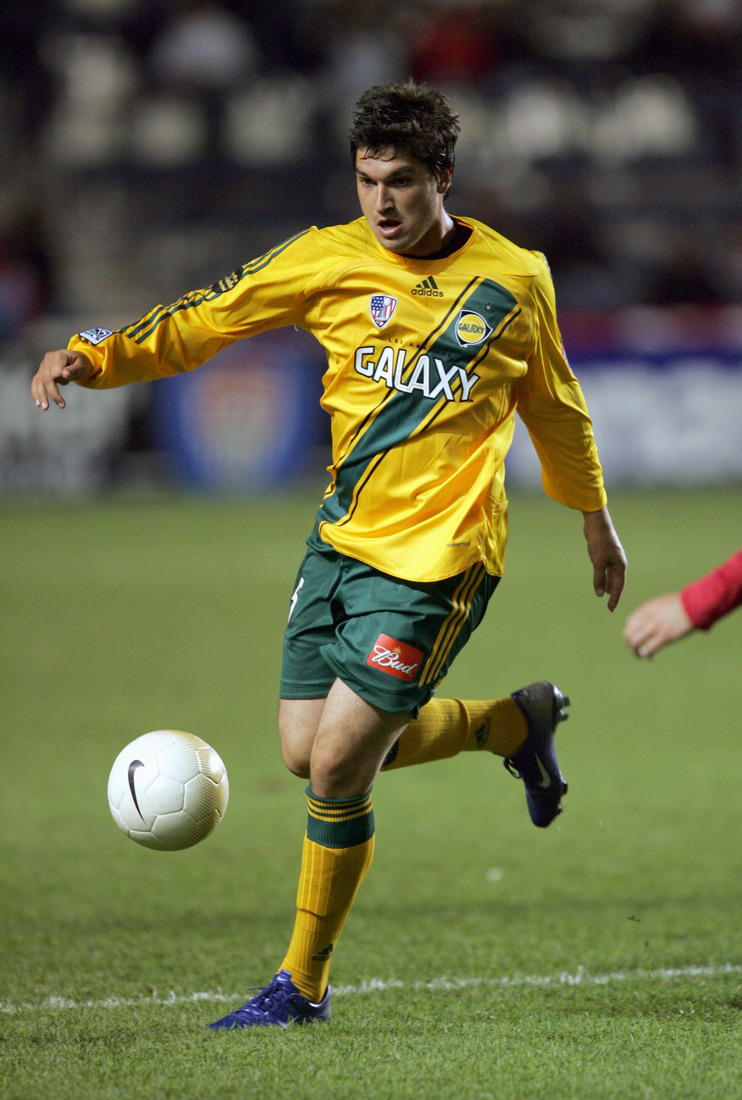
Now, 2007 was a big year for the Galaxy, it's the year David Beckham came over. But my tiny nit-picky problem with the press release is while the Galaxy continued to wear green and gold all the way up to Beckham's arrival when they unveiled the new colors, the team had already embraced the white at home concept from the beginning of the season.
The above photo is from a match at The Home Depot Center against Chivas USA in April of 2007 with the Galaxy the designated home team. There are two possibilities I can see: either the Herbalife shirt sponship patch making its debut that year looked best on the white jersey dictating the switch, or the blue/gold logo-white kit at home color change was already in the works for 2008 but Beckham's arrival pushed things up a bit.
The sash pays tribute to 2007 in another way, as not only did the logo switch from green/gold to blue/gold but the spiral Galaxy was replaced by a quasar. And you thought it was just a star. For the non-astrophysicists among us, as I understand it a quasar is an ultra bright galactic nucleus, the points you see in the Galaxy crest being beams of light coming out of this massive core of energy.
Here's Alexi Lalas talking about the quasar back in 2007:
"A Quasar is the heart of a galaxy and generates incredible light and energy," added Lalas. "Our crest shows a Quasar shining brightly in a deep blue California sky. It illuminates the initials "LA", used globally to refer to our City of Angels. The color gold honors the Galaxy's proud history and tradition in the Golden State."
The shirt I was sent lack the Scudetto patch, which features the MLS cup with the Championship star above it for their win last season. The star above the cup on the Scudetto has the number 11 to commemorate the championship year. Since the switch to the new MLS Cup, the Scudetto has gotten much cleaner as a patch unlike that cluttered one from 2006.
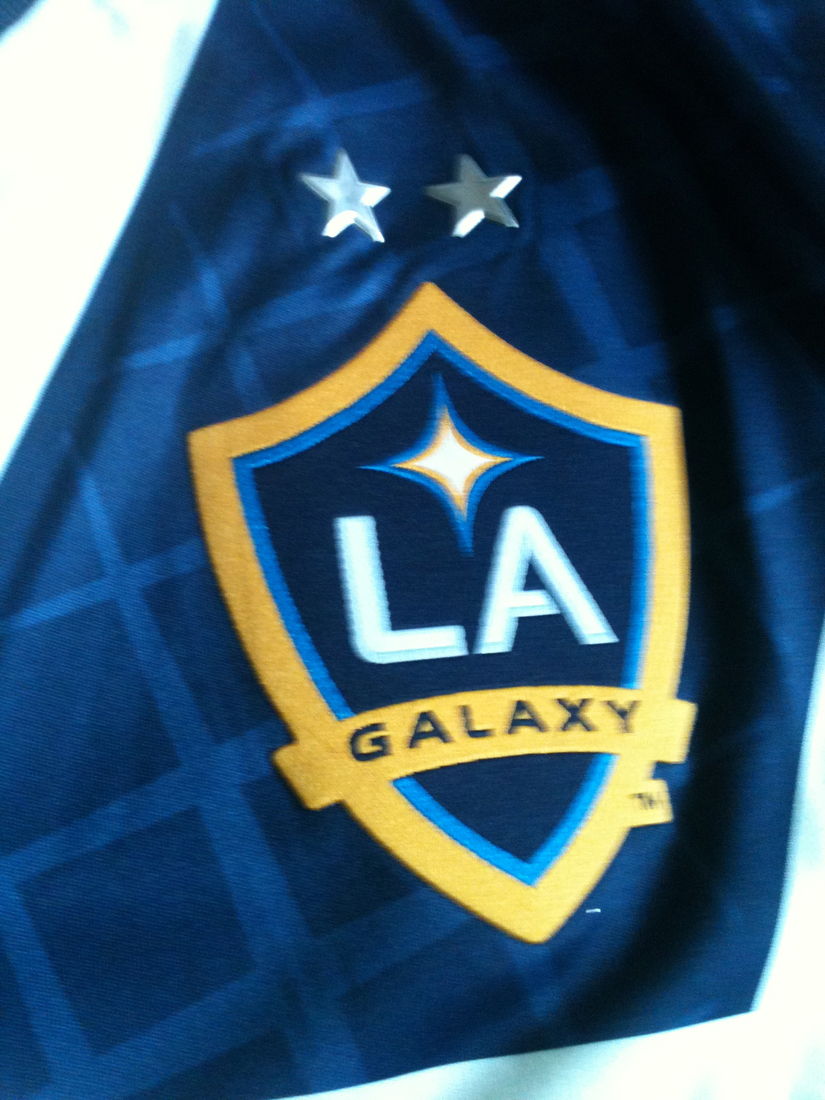
Of course, the stars above the team crest signify the number of championships the Galaxy have won. Next season the jersey will have the 3 championship stars above the team crest. And perhaps, another year with the Scudetto.