Rebranding is no small task, yet that's the one that Alexi Lalas and the LA Galaxy took on in 2007. It's a step almost every original MLS team has taken, shedding off the old brand to re-emerge in MLS 2.0. We're all familiar with the shield that now adorns the Galaxy kits, but I've been on a mission to find some of the designs that didn't make the cut.

via zuzuku.com
I finally found one this afternoon. Lalas worked with a company called SME Branding. They've handled many sports campaigns including MLS' "Football.Futbal.Soccer" and work for adidas.
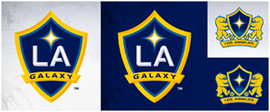
Hopefully I'll get to chat with the designers soon, but when I found this I just had to share. There isn't much by the way of pixels there, so even after blowing the image up I can't tell what the animals on the side of the shield are.
Have to say, I like it a lot but I can see how the shield on its own is better. I enjoy the mystery animals with soccer balls, but the shield looks a bit plain with just the quasar inside. This is also before the club officially changed from Los Angeles to LA.
I kind of prefer Los Angeles, to be honest, LA is a nickname and even if everyone uses the nickname the full name should still be present somewhere.
So what do you think of this mystery prototype?